Blog / StoriesFrom The Field
Paintings in Oils by Roos Schuring.
Plein air painting, Images & Videos, Enjoy!
How-to Parasols
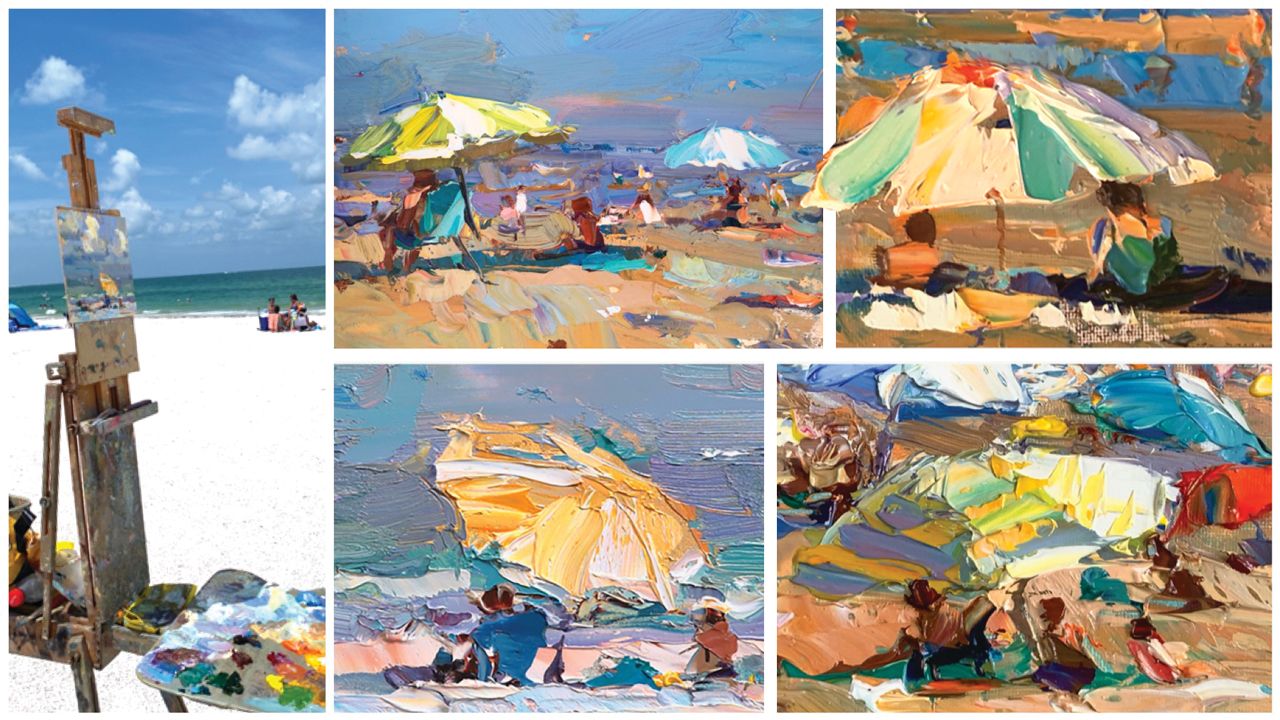
Painting Parasols at the Beach,
and Tips in this...
This list of tips was partly born from teaching in Florida and from teaching here on the beach of Holland.
Also, I talked with my children about 'the do's and don'ts' involving parasols when they started painting the parasols in watercolor, so I thought to do a write-up on it.
Take from it what you like, as this is of course all a personal view on this topic, but it might help you too.
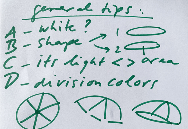
A) COLOR
A) I wrote often about choosing the color of the parasol, if it's a crowded beach you may be able to choose one that would work (better) in your painting.
For example, in my opinion, white works wonders, then after that, yellows, light colors work great, turquoises against (purple) blue skies, etc. Then, the opposite, darks, dark blue, dark green, grey don't work as well. Why? I think lighter colors help the sunniness you can capture. Helps the sand color be a working mid-tone.
B) SHAPE
B) Don't make parasols too high: even when the stick (pole) is long, drop it down: makes it more cosy (romantic / painterly) and less awkward somehow.
Example,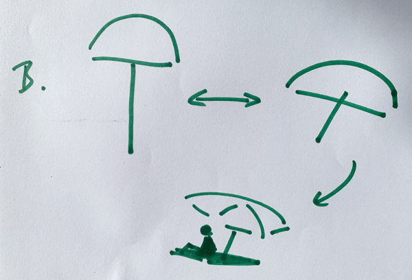
C) PLACEMENT
C) In enhancing it's light effect it does help to get the sand color surrounding it 'right'. Sometimes you might be sitting down, so you might see the parasols in front of water.
You will see how either sand or water look way darker compared to the highlighted part of the parasol.
When you create a mid-tone for this background color, whether it's sky, sand, water, you will see the parasol 'POP', enhancing the light effect on the parasol, enhancing sunniness overall. Maybe a logic idea, but I see artists often struggle with this. So, either add more light colors to the parasol itself, or darken up its background... exceptions to the rule can be there of course...
Example,
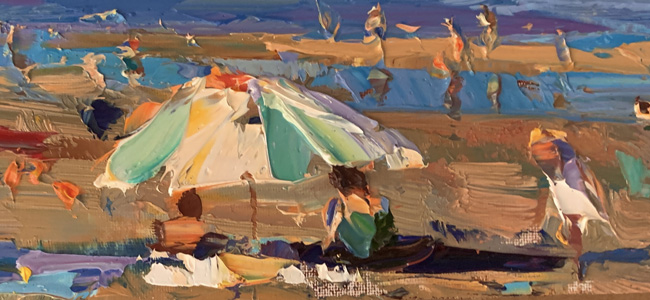
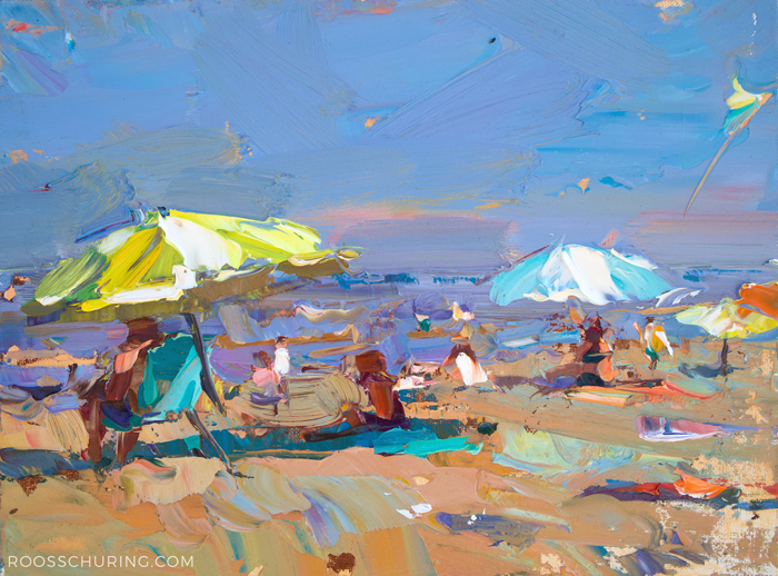 286. SSU06-2025 Seascape Parasol Day 20x25 cm | 8x10"
D) COLORING THE PARTS
D) I like to apply paint with a knife, in the beginning stages of the painting. Or, when you need to get a bold or strong shape, or an absolute highlight, or high dark, applying colormixes with the knife can give a strong effect, because the color that you mixed, you get onto the canvas 1:1, there is no loss by brushing into already applied paint and such..
Often I say to my students "Don't brush down 50 strokes to convey a simple strong shape or simple strong effect."
Because often, what you're trying to reach is a color-effect, what you need is a few areas in the right color, which can be done with a few knife-applications, or, a few brushmarks loaded with enough paint on...
A few areas in the 'right color' can make strokes into an object!
Don't 'cramp up' for a/any seemingly complex shape...instead: simplify! Here's how:
Divide the shape of the parasol into simple 'blocks of color'. Determine the colors, Mix, Apply.
The more experience you have, the more you can 'apply and leave it alone', or to say, the less you'll need fussing with it.
Here an example,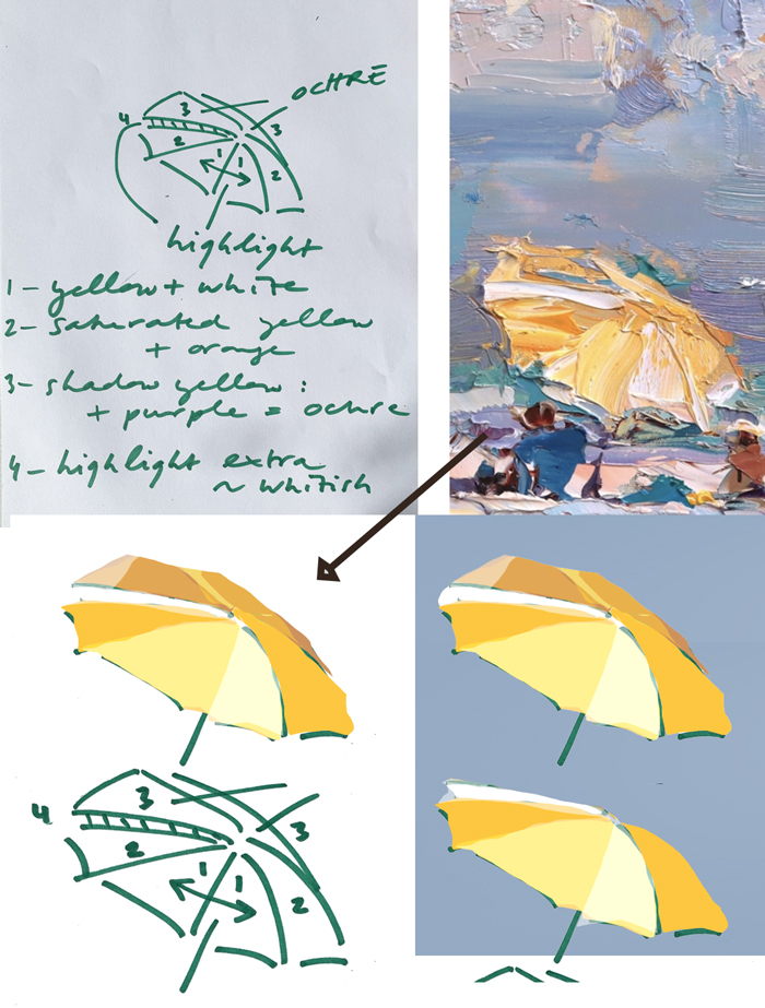
With above image: I paint the individual parts roughly as shown,
1, highlight, yellow+white
2. secondary highlight, a more saturated yellow (+orange)
3. a shadow yellow (+purple creates an ochre)
4. extra highlight, whitish
3-Dimensionality can be very easily reached by placing highlights, and shadows, and a color in between.
And here is an impression of the parasol we saw, it's of course relative, the sun will turn as you're painting it, yet, it makes a lot of sense to try to simplify the (or any) object you paint to get closer to the essence of it and to also be speedy enough to get everything painted before it changes. 
E) SHADOWS
Of course, to paint light or sunlight we do need to paint the shadows. On the sand, a stripe of shadow is often enough. The figures might be in shade too.
F) STRIPES? BACKLIGHT?
Keeping it as simple as you can, merely focussing on the color you need to mix for simplified areas is one of the BEST TIPS you can get to paint really everything. Color is the key in REALISM. You can test this notion: create an abstract painting of a complex scene, then, when your colors are chosen well, and you look at a thumbnail of the painting (or you take 30 steps away from it to see it tiny) you'll see it's like a photo of the scene you saw. Not because of details! No! Just because you chose the colors well.
Here an example, a striped parasol, similarly painted in the 'less is more' technique,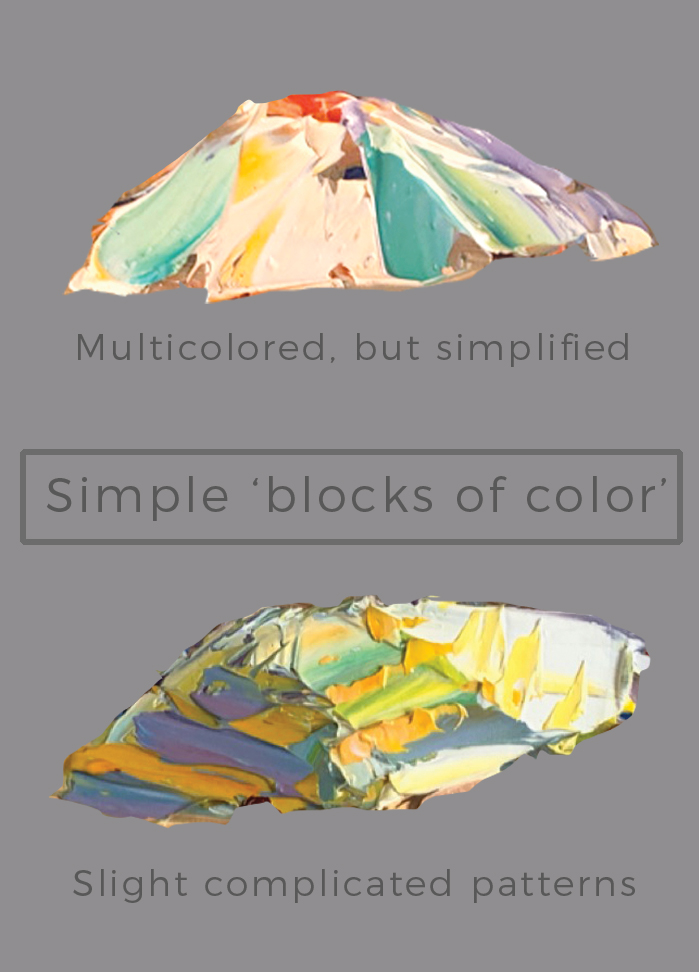
Here a complex combination, a multi-colored parasol in sunset backlight.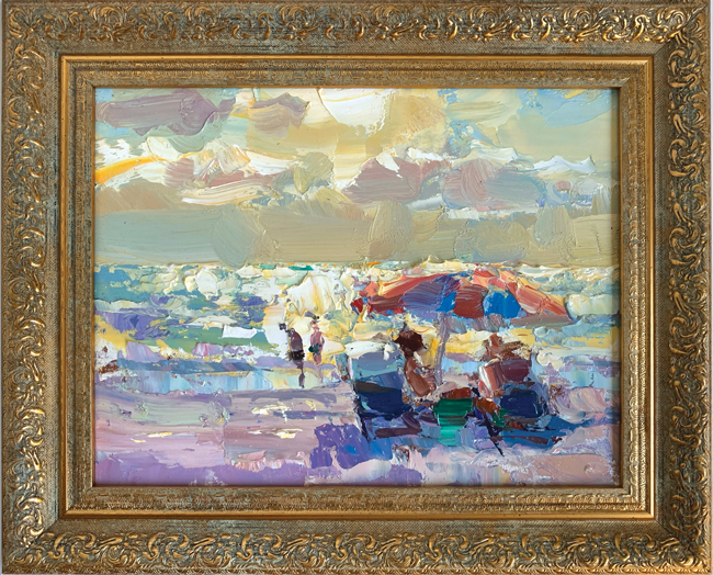
322. SSU-2025 Seascape Florida Parasol See-through Sunset 20x25 cm | 8x10"
We're here headed into Autumn, but, as it will be fully Winter in February, we'll fly back to the sun and the parasols in Florida!
For now, (for you/gardeners, growers, farmers) enjoy the extra time now that 'growing season' eased off a bit, more time to clean, to organise, to repaint your living-spaces, house, to organise your artworks, to varnish and frame, to create books and your Christmas card..?
If I speak for myself, I can finally breathe and tend to all of these indoor tasks since we finally got our irrigation from the sky (since 6 months of drought!)! Simple things can make you happy. The sun, the rain, growing things, painting things, cleaning, making stuff more beautiful.
Hugs!
- Roos
Find these and all other Florida paintings (310-328) in my paintings shop here
YOU can join us in Florida/St. Pete's Beach to PAINT!
A very unique opportunity, paint a lot, learn new things, and come home with pretty paintings that you can sell, exhibit. This February 2026,
INFO | JOIN HERE
Posts and Paintings per Category:
■ SEASCAPES
■ SUNRISE-SUNSET
■ CLOUDS
■ GREY
■ LANDSCAPES
■ NOCTURNES
■ COWS
■ SNOW
■ SUMMER
■ FIGURES
■ FLOWERS

Roos Schuring
Painter
Hi, Good to see you here!I hope you are enjoying my outdoor painting Blog and Vlog where I'm sharing my findings and my painting endeavours with you!
Find the Books here, Painting Demos here.
FIND BLOG POSTS PER THEME:
RECENT POSTS
Tips to Paint Snowscapes Outdoors
Relative Relationships in Color


GET MY LATEST VIDEOS INTO YOUR INBOX
Stay In The Loop
If you want to get notified when I have published New Vlogs, you can get my Blog-Vlog update every month. Sign up here
✔ Blog Digest Monthly
✔ Watch New Vlogs
✔ View New Paintings First
✔ View New Products First
(✔ Best deals)
